- We have already provided some rules to follow as we created plots for our examples.
- Here we aim to provide some general principles we can use as a guides for effective data visualization.
- Much of this section is based on a talk by Karl Broman titled "Creating effective figures and tables" including some of the figures which were made with code that Karl makes available on his GitHub repository, and class notes from Peter Aldhous' Introduction to Data Visualization course.
18-8-1
Some Data Visualization Principles
Some Data Visualization Principles
- Following Karl's approach, we show some examples of plot styles we should avoid, explain how to improve them, and use these as motivation for a list of principles.
- We compare and contrast plots that follow these principles to those that don't.
Some Data Visualization Principles
- The principles are mostly based on research related to how humans detect patterns and make visual comparisons.
- The preferred approaches are those that best fit the way our brains process visual information.
- When deciding on a visualization approach it is also important to keep our goal in mind.
- We may be comparing a viewable number of quantities, describing distribution for categories or numeric values, comparing the data from two groups, or describing the relationship between two variables.
Some Data Visualization Principles
- As final note, we also note that for a data scientist it is important to adapt and optimize graphs to the audience.
- For example, an exploratory plot made for ourselves will be different than a chart intended to communicate a finding to a general audience.
Some Data Visualization Principles
- We will be using these libraries:
library(tidyverse)
library(gridExtra)
library(dslabs)
ds_theme_set()
Encoding data using visual cues
- We start by describing some principles for encoding data.
- There are several approaches at our disposal including position, aligned lengths, angles, area, brightness, and color hue.
Angles

Area

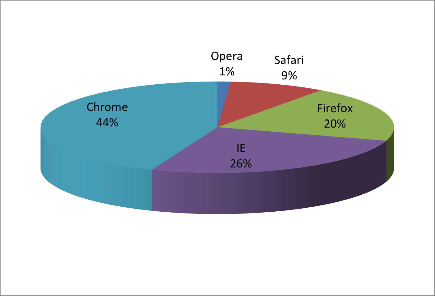
Pie chart of browser usage.
Pie charts
- The
pieR function help file states
"Pie charts are a very bad way of displaying information. The eye is good at judging linear measures and bad at judging relative areas. A bar chart or dot chart is a prefe
A table
| Browser | 2000 | 2015 |
|---|---|---|
| Opera | 3 | 2 |
| Safari | 21 | 22 |
| Firefox | 23 | 21 |
| Chrome | 26 | 29 |
| IE | 28 | 27 |
barplots use position and length

barplots v barplots

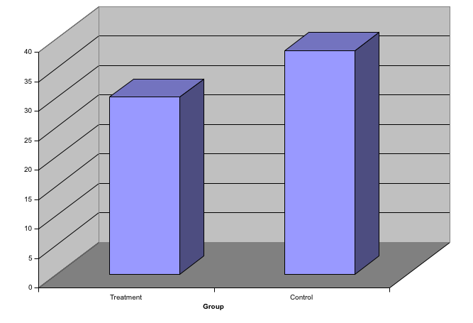
Know when to include 0
- When using barplots it is dishonest not to start the bars at 0.
- This is because, by using a barplot, we are implying the length is proportional to the quantities being displayed.
- By avoiding 0, relatively small difference can be made to look much bigger than they actually are.
- This approach is often used by politicians or media organizations trying to exaggerate a difference.
Know when to include 0

- (Source: Fox News, via Peter Aldhous via Media Matters via Fox News) via Media Matters.
Know when to include 0

Know when to include 0

Know when to include 0

Know when to include 0
- When using position rather than length, then it is not necessary to include 0.
- This is particularly the case when we want to compare differences between groups relative the variability seen within the groups.
Know when to include 0

Do not distrort quantities

Radius versus Area

Do not distrort quantities
- Not surprisingly, ggplot defaults to using area rather than radius.
- Of course, in this case, we really should not be using area at all since we can use position and length:
A barplot

Order by a meaningful value
data(murders)
p1 <- murders %>% mutate(murder_rate = total / population * 100000) %>%
  ggplot(aes(state, murder_rate)) +
  geom_bar(stat="identity") +
  coord_flip() +
  xlab("")

p2 <- murders %>% mutate(murder_rate = total / population * 100000) %>%
  mutate(state = reorder(state, murder_rate)) %>%
  ggplot(aes(state, murder_rate)) +
  geom_bar(stat="identity") +
  coord_flip() +
  xlab("")
grid.arrange(p1, p2, ncol = 2)
Order by meaningful value

plot discussion
- Note that the
reorderfunction lets us reorder groups as well. - Earlier we saw an example related to income distributions across regions. Here are the two versions plotted against each other:

Show the data
- We have focused on displaying single quantities across categories.
- We now shift our attention to displaying data, with a focus on comparing groups.
Show the data
- To motivate our first principle, show the data, imagine you are describing heights to ET, an extraterrestrial.
- This time let's assume ET is interested is the difference in heights between males and females.
- A commonly seen plot used for comparisons between groups, popularized by software such as Microsoft Excel, shows the average and standard errors (standard errors are defined in a later chapter, but don't confuse them with the standard deviation of the data).
Show the data

Show the data
- This brings us to the principle: show the data.
- This simple ggplot code already generates a more informative plot than the barplot by simply showing all the data points:
Show the data
heights %>% ggplot(aes(sex, height)) + geom_point()

Jitter and alpha blending
heights %>% ggplot(aes(sex, height)) + geom_jitter(width = 0.1, alpha = 0.2)

Ease comparisons: Use common axes
Ease comparisons: Use common axes

Ease comparisons: Use common axes

Ease comparisons

Ease comparisons: Use common axes

Ease comparisons: Use common axes
grid.arrange(p1, p2, p3, ncol = 3)

Consider transformations

Consider transformations

Consider transformations

Consider transformations
Ease comparisons: Visual cues to be compared should be adjacent
- When comparing income data between 1970 and 2010 across region we made a figure similar to the one below.
- A difference is that here we look at continents instead of regions, but this is not relevant to the point we are making.
Ease comparisons: Visual cues to be compared should be adjacent

Ease comparisons: Visual cues to be compared should be adjacent
- Note that, for each continent, we want to compare the distributions from 1970 to 2010.
- The default in ggplot is to order alphabetically so the labels with 1970 come before the labels with 2010, making the comparisons challenging.
Ease comparisons

Ease comparison: use color

Think of the color blind
- Here is an example of how we can use color blind friendly pallet described here:
Think of the color blind
color_blind_friendly_cols <- c("#999999", "#E69F00", "#56B4E9", "#009E73", "#F0E442", "#0072B2", "#D55E00", "#CC79A7")
p1 <- data.frame(x=1:8, y=1:8, col = as.character(1:8)) %>% ggplot(aes(x, y, color = col)) + geom_point(size=5)
p1 + scale_color_manual(values=color_blind_friendly_cols)

Think of the color blind
- There are several resources that help you select colors, for example this one.
Scatter-plots for two variables
- In every single instance in which we have examined the relationship between two variables, total murders versus population size, life expectancy versus fertility rates, and child mortality versus income, we have used scatter plots.
- This is the plot we generally recommend.
Slope charts
west <- c("Western Europe","Northern Europe","Southern Europe",
          "Northern America","Australia and New Zealand")

dat <- gapminder %>%
  filter(year%in% c(2010, 2015) & region %in% west &
           !is.na(life_expectancy) & population > 10^7)

dat %>%
  mutate(location = ifelse(year == 2010, 1, 2),
         location = ifelse(year == 2015 & country%in%c("United Kingdom","Portugal"), location+0.22, location),
         hjust = ifelse(year == 2010, 1, 0)) %>%
  mutate(year = as.factor(year)) %>%
  ggplot(aes(year, life_expectancy, group = country)) +
  geom_line(aes(color = country), show.legend = FALSE) +
  geom_text(aes(x = location, label = country, hjust = hjust),
            show.legend = FALSE) +
  xlab("") + ylab("Life Expectancy")
Slope charts

Slope charts
- An advantage of the slope chart is that it permits us to quickly get an idea of changes based on the slope of the lines.
- Note that we are using angle as the visual cue.
- But we also have position to determine the exact values.
- Comparing the improvements is a bit harder with a scatter plot:
Scatter plot

Bland-Altman plot

Encoding a third variable

Encoding a third variable

Encoding a third variable
- For continuous variables we can use color, intensity or size.
- We now show an example of how we do this with a case study.
Case Study: Vaccines
Case Study: Vaccines
data(us_contagious_diseases)
str(us_contagious_diseases)
## 'data.frame':    18870 obs. of  6 variables:
##  $ disease        : Factor w/ 7 levels "Hepatitis A",..: 1 1 1 1 1 1 1 1 1 1 ...
##  $ state          : Factor w/ 51 levels "Alabama","Alaska",..: 1 1 1 1 1 1 1 1 1 1 ...
##  $ year           : num  1966 1967 1968 1969 1970 ...
##  $ weeks_reporting: int  50 49 52 49 51 51 45 45 45 46 ...
##  $ count          : num  321 291 314 380 413 378 342 467 244 286 ...
##  $ population     : num  3345787 3364130 3386068 3412450 3444165 ...
Case Study: Vaccines
the_disease <- "Measles"
dat <- us_contagious_diseases %>%
  filter(!state%in%c("Hawaii","Alaska") & disease == the_disease) %>%
  mutate(rate = count / population * 10000) %>%
  mutate(state = reorder(state, rate))
Case Study: Vaccines
dat %>% filter(state == "California") %>%
  ggplot(aes(year, rate)) +
  geom_line() + ylab("Cases per 10,000")  +
  geom_vline(xintercept=1963, col = "blue")
Case Study: Vaccines

Paletts
library(RColorBrewer)
display.brewer.all(type="seq")

Paletts
- Diverging colors are used to represent values that diverge from a center.
- We put equal emphasis on both ends of the data range: higher than the center and lower than the center.
- An example of when we would use a divergent pattern would be if we were to show height in standard deviations away from the average.
- Here are some examples of divergent patterns:
Paletts
library(RColorBrewer)
display.brewer.all(type="div")

Paletts
dat %>% ggplot(aes(year, state,  fill = rate)) +
  geom_tile(color = "grey50") +
  scale_x_continuous(expand=c(0,0)) +
  scale_fill_gradientn(colors = brewer.pal(9, "Reds"), trans = "sqrt") +
  geom_vline(xintercept=1963, col = "blue") +
  theme_minimal() +  theme(panel.grid = element_blank()) +
  ggtitle(the_disease) +
  ylab("") +
  xlab("")
Paletts

Aother plot

Avoid pseudo three dimensional plots
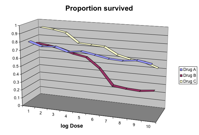
- The figure below, taken from the scientific literature [CITE: DNA Fingerprinting: A Review of the Controversy Kathryn Roeder Statistical Science Vol. 9, No. 2 (May, 1994), pp. 222-247] shows three variables: dose, drug type and survival.
- Although your screen/book page is flat and two dimensional, the plot tries to imitate three dimensions and assigned a dimension to each variable.
Avoid pseudo three dimensional plots
Avoid pseudo three dimensional plots

This plot demonstrates that using color is more than enough to distinguish the three lines.
Avoid gratuitousthree dimensional plots
Avoid gratuitousthree dimensional plots
Avoid too any significant digits
- By default, statistical software like R returns many significant digits.
- The default behavior in R is to show 7 significant digits.
- So many digits often adds no information and the visual clutter than can makes it hard for the consumer of your table to understand the message.
- As an example here are the per 10,000 disease rates for California across the five decades
Avoid too any significant digits
| state | year | Measles | Pertussis | Polio |
|---|---|---|---|---|
| California | 1940 | 37.8826320 | 18.3397861 | 18.3397861 |
| California | 1950 | 13.9124205 | 4.7467350 | 4.7467350 |
| California | 1960 | 14.1386471 | 0.0000000 | 0.0000000 |
| California | 1970 | 0.9767889 | 0.0000000 | 0.0000000 |
| California | 1980 | 0.3743467 | 0.0515466 | 0.0515466 |
Avoid too any significant digits
## `mutate_each()` is deprecated.
## Use `mutate_all()`, `mutate_at()` or `mutate_if()` instead.
## To map `funs` over a selection of variables, use `mutate_at()`
| state | year | Measles | Pertussis | Polio |
|---|---|---|---|---|
| California | 1940 | 37.9 | 18.3 | 18.3 |
| California | 1950 | 13.9 | 4.7 | 4.7 |
| California | 1960 | 14.1 | 0.0 | 0.0 |
| California | 1970 | 1.0 | 0.0 | 0.0 |
| California | 1980 | 0.4 | 0.1 | 0.1 |
Avoid too any significant digits
- Useful ways to change the number of significant digits or to round number are
signifandround. - You can define the number of significant digits use globally by siting options like this: `
Avoid too any significant digits
## `mutate_each()` is deprecated.
## Use `mutate_all()`, `mutate_at()` or `mutate_if()` instead.
## To map `funs` over a selection of variables, use `mutate_at()`
| state | disease | 1940 | 1950 | 1960 | 1970 | 1980 |
|---|---|---|---|---|---|---|
| California | Measles | 37.9 | 13.9 | 14.1 | 1 | 0.4 |
| California | Pertussis | 18.3 | 4.7 | 0.0 | 0 | 0.1 |
| California | Polio | 18.3 | 4.7 | 0.0 | 0 | 0.1 |
Know your audience
- Graphs can be used for our 1) own exploratory data analysis, 2) to convey a message to experts, or 3) to help tell a story to a general audience.
- Make sure that the intended audience of your final produce understands each element of the plot.
Know your audience
- As a simple example, consider that for your own exploration it may be more useful to log data and then plot.
- While for a general audience, not familiar with converting logged values back to the original measurements, using a log-scale for the axis will be better.
Further reading:
- ER Tufte (1983) The visual display of quantitative information. Graphics Press.
- ER Tufte (1990) Envisioning information. Graphics Press.
- ER Tufte (1997) Visual explanations. Graphics Press.
- WS Cleveland (1993) Visualizing data. Hobart Press.
- WS Cleveland (1994) The elements of graphing data. CRC Press.
- A Gelman, C Pasarica, R Dodhia (2002) Let's practice what we preach: Turning tables into graphs. The American Statistician 56:121-130.
- NB Robbins (2004) Creating more effective graphs. Wiley.
- Nature Methods columns
- A Cairo (2013) The Functional Art: An Introduction to Information Graphics and Visualization. New Riders
- N Yau (2013) Data Points: Visualization That Means Something. Wiley